Branding

IN SYNC
In Sync is a sleep brand designed for people whose minds don't naturally clock out. It transforms intentional wind-down into a clear, reassuring ritual through strategy, identity, and a connected product system.
Year :
2026
Industry :
Wellness
Duration :
1 week
Role :
Brand Strategist · Visual Designer
Client :
AI Catalyst Branding Workshop
Type :
Concept Branding

Problem :
Sleep and wellness are often surrounded by vague promises, calming clichés, and pseudoscience.
For people whose minds don't naturally clock out, simply being told to “relax” isn't enough.
The challenge was to make intentional preparation for sleep feel useful rather than burdensome.
The brand needed to create structure without making rest feel clinical or complicated.
It also had to stand apart from the familiar visual language of wellness brands.

Solution :
Created In Sync, a sleep system built around the idea “Clear to rest.”
The brand combines a Sage archetype with a Caregiver flavour to make structure feel reassuring.
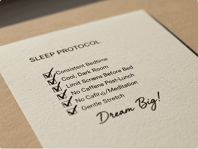
A bedding system, wind-down device, and pre-sleep protocol create a connected ritual.
Mission-inspired language and visual systems bring clarity without sacrificing warmth.
The identity translates precise, structured thinking into a calmer environment for rest.

Challenge :
Translate the precision and discipline of a mission-driven system into something appropriate for the bedroom.
Balance precision with warmth and structure with gentleness.
Create a brand that feels reassuring rather than clinical or overly technical.
Build a distinctive visual and verbal system that could extend across multiple touchpoints.
Make the idea of a sleep “protocol” feel inviting rather than like another task to complete.
Summary :
In Sync reimagines sleep as something that can be intentionally prepared for, without turning rest into work.
The project began with a strategic Brand DNA built around Audience, Enemy, Promise, Archetype, and Keywords.
Those decisions shaped the visual identity, product language, protocol system, and art direction.
The result is a cohesive sleep brand designed for people whose minds don't naturally clock out.
A fictional brand concept developed as part of the AI Catalyst Branding & Visuals Workshop.

More Projects



Branding
IN SYNC
In Sync is a sleep brand designed for people whose minds don't naturally clock out. It transforms intentional wind-down into a clear, reassuring ritual through strategy, identity, and a connected product system.
Year :
2026
Industry :
Wellness
Duration :
1 week
Role :
Brand Strategist · Visual Designer
Client :
AI Catalyst Branding Workshop
Type :
Concept Branding
Problem :
Sleep and wellness are often surrounded by vague promises, calming clichés, and pseudoscience.
For people whose minds don't naturally clock out, simply being told to “relax” isn't enough.
The challenge was to make intentional preparation for sleep feel useful rather than burdensome.
The brand needed to create structure without making rest feel clinical or complicated.
It also had to stand apart from the familiar visual language of wellness brands.
Solution :
Created In Sync, a sleep system built around the idea “Clear to rest.”
The brand combines a Sage archetype with a Caregiver flavour to make structure feel reassuring.
A bedding system, wind-down device, and pre-sleep protocol create a connected ritual.
Mission-inspired language and visual systems bring clarity without sacrificing warmth.
The identity translates precise, structured thinking into a calmer environment for rest.
Challenge :
Translate the precision and discipline of a mission-driven system into something appropriate for the bedroom.
Balance precision with warmth and structure with gentleness.
Create a brand that feels reassuring rather than clinical or overly technical.
Build a distinctive visual and verbal system that could extend across multiple touchpoints.
Make the idea of a sleep “protocol” feel inviting rather than like another task to complete.
Summary :
In Sync reimagines sleep as something that can be intentionally prepared for, without turning rest into work.
The project began with a strategic Brand DNA built around Audience, Enemy, Promise, Archetype, and Keywords.
Those decisions shaped the visual identity, product language, protocol system, and art direction.
The result is a cohesive sleep brand designed for people whose minds don't naturally clock out.
A fictional brand concept developed as part of the AI Catalyst Branding & Visuals Workshop.
More Projects
Branding
IN SYNC
In Sync is a sleep brand designed for people whose minds don't naturally clock out. It transforms intentional wind-down into a clear, reassuring ritual through strategy, identity, and a connected product system.
Year :
2026
Industry :
Wellness
Duration :
1 week
Role :
Brand Strategist · Visual Designer
Client :
AI Catalyst Branding Workshop
Type :
Concept Branding
Problem :
Sleep and wellness are often surrounded by vague promises, calming clichés, and pseudoscience.
For people whose minds don't naturally clock out, simply being told to “relax” isn't enough.
The challenge was to make intentional preparation for sleep feel useful rather than burdensome.
The brand needed to create structure without making rest feel clinical or complicated.
It also had to stand apart from the familiar visual language of wellness brands.
Solution :
Created In Sync, a sleep system built around the idea “Clear to rest.”
The brand combines a Sage archetype with a Caregiver flavour to make structure feel reassuring.
A bedding system, wind-down device, and pre-sleep protocol create a connected ritual.
Mission-inspired language and visual systems bring clarity without sacrificing warmth.
The identity translates precise, structured thinking into a calmer environment for rest.
Challenge :
Translate the precision and discipline of a mission-driven system into something appropriate for the bedroom.
Balance precision with warmth and structure with gentleness.
Create a brand that feels reassuring rather than clinical or overly technical.
Build a distinctive visual and verbal system that could extend across multiple touchpoints.
Make the idea of a sleep “protocol” feel inviting rather than like another task to complete.
Summary :
In Sync reimagines sleep as something that can be intentionally prepared for, without turning rest into work.
The project began with a strategic Brand DNA built around Audience, Enemy, Promise, Archetype, and Keywords.
Those decisions shaped the visual identity, product language, protocol system, and art direction.
The result is a cohesive sleep brand designed for people whose minds don't naturally clock out.
A fictional brand concept developed as part of the AI Catalyst Branding & Visuals Workshop.